
_logo%201.png)
Instant communication is crucial for effective hiring. Traditional channels like email and calling add time and friction. Modern tools like instant messaging and chatbots streamline the process, improving candidate experience and reducing time and costs.
Text messaging is the fastest and preferred hiring communication method.
This experience was elevated by integrating SMS (text-messaging) as a means of communication. The final deliverable was a standalone component that was integrated into the line of products for UKG. Initially, this was integrated into the ATS (Applicant Tracking System) which is used daily by Recruiters.
I'm proud of having worked on this project as it was very challenging in many regards.
This unique web interface enables SMS communication, providing a standard messaging experience that supports UKG's market parity product strategy.
Our team of three product designers, led by me, faced the challenge of delivering maximum value quickly. Moreover, this feature supports UKG's up-market growth and was built using a new design system on top of a legacy UI, within a six-month delivery timeline, and required cross-team collaboration to integrate with the platform's centralized services.
To get started on the project, I led several design studio workshops with a team of three designers. We collaborated to generate and evaluate ideas, refining them through additional workshops with product and engineering stakeholders.
Text messaging is the fastest and preferred hiring communication method.

We reached a common consensus to pursue a floating (or overlay) panel, similar to the convention seen on popular social media experiences.
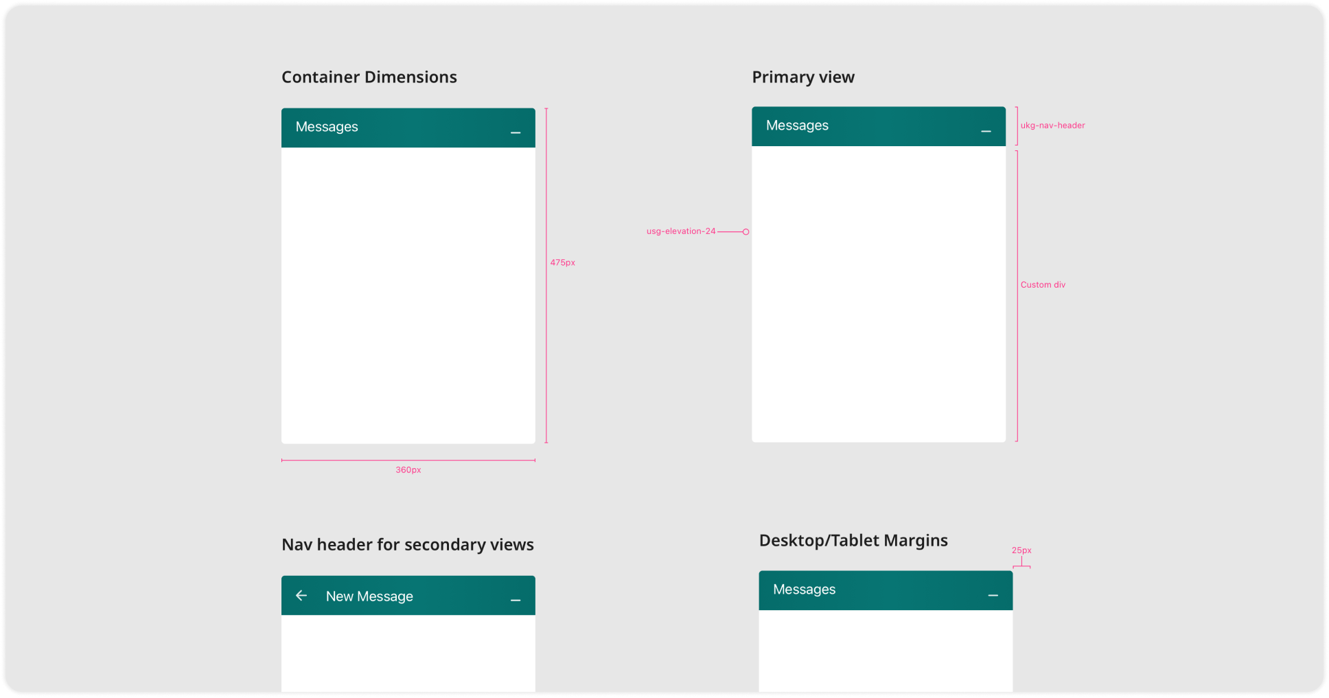
Defining the dimensions of the component was crucial, as it would be used throughout the suite. To ensure usability across different contexts and common browser resolutions, I collaborated closely with the Design System team and analyzed usage analytics.
As a result, we created a fixed-height and width panel that adapted well across different viewports and devices, significantly reducing development time.

My task was to define a visual design hierarchy for the SMS messaging component while adhering to the limitations of the Design System and Brand Guidelines. This involved addressing various factors such as distinguishing between sender and recipient messages, time-stamping, message grouping, status indicators, and ensuring color contrast for accessibility.

This was perhaps the simplest view, but one of the most fun tasks to explore. It was all about seeking user engagement while striking a balance leveraging existing assets and patterns across the suite.

Designing the ability to send messages to a group of candidates was one of the most complex interactions, requiring careful consideration from a business logic and engineering perspective.
To tackle this challenge, I led a team of three designers in researching and exploring potential solutions. My approach involved proposing separate alternatives to compare and choose the best ideas.

As an area of focus, inclusion and accessibility was still maturing at UKG, which meant that all disciplines across the product organization were adapting to new waters. As a designer, I partnered with our internal accessibility specialists to define the team's needs. I created an annotations template that was used by the team, but more importantly, I facilitated learning about the key aspects of assistive technologies and how to effectively communicate with stakeholders to convey intent.


